It takes less than two-tenths of a second for an online visitor to form a first opinion about your website and your brand. The psychological reason that an impression is communicated so quickly is that good design has a mood and a personality. Subsequently, fonts, as part of your design, express them with non-verbal cues. This is where you can benefit from the application of psychology to your website font selection.
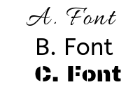
Of the fonts above, which is better for a fitness class, for a board game, and for makeup?
Ten to one odds you chose C, A, then B.
But why?
They just FELT right, didn’t they?
Fonts also have their own unique personalities, as different fonts have been designed for different purposes. But how do you know which font is right for your own brand? Something conventional? Bold? Quirky? Your font choices will undoubtedly influence your audience’s expectations, so making the right choice is crucial.
Let’s take a look at how typefaces hack our brains and how you can hack its code, influence more people, and take your brand to new heights.
INTERSECTION OF PURPOSE & PERSONALITY
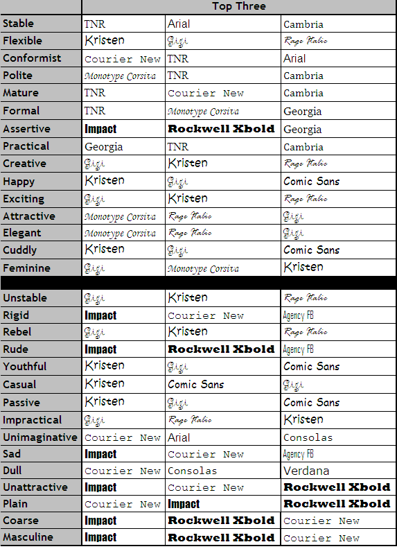
In the intersecting worlds of marketing and design, the first thing to know is that there’s purpose behind each font style. Interestingly enough, they intersect to the degree that each has their own personality. A study conducted in 2006 at Wichita State University looked at the personality traits people associated with different fonts. They asked participants to rate the personality of 20 fonts using 15 adjectives.
The results? More basic fonts, such as Arial and Courier New, were considered “stable” and “mature” as well as “unimaginative” and “conformist.” In contrast, other fonts like Kirsten and Comic Sans were considered “happy,” “youthful,” and “casual.”
Here are the top three fonts for each descriptive word:
THE RIGHT FONT IS VITAL TO YOUR BRAND
See how vital the right font is to your brand’s overall message and success?
Go back and look at the traits given to the fonts in the chart. Notice something? Every trait is an adjective that describes stimuli outside of the font world. THAT’S THE KEY! Fonts share visual characteristics from the real world. You can harness that key and employ the psychology in font selection.
What’s the first lesson in choosing a font for your brand? If you want to choose an appropriate font, choose a font that visually resembles your context.
NARROWING IT DOWN: THE SIX MAJOR FONT FAMILIES
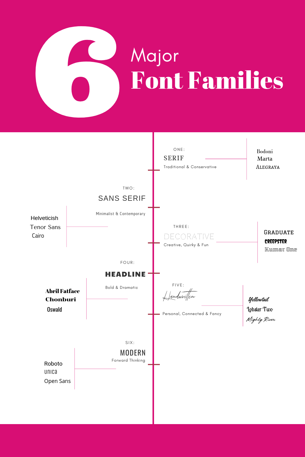
Though the list of fonts may seem endless, there are actually only six main font categories, each having a distinct personality of their own:
- Serif
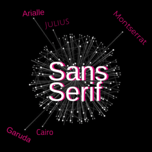
- Sans Serif
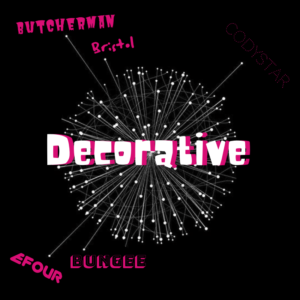
- Decorative
- Headline
- Handwritten
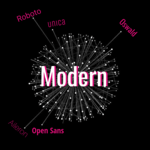
- Modern
All fonts fall under the umbrella of one of these six, so choosing the right one for your brand isn’t as complex as you might think. First, identify which of the six styles fits your brand or company best, then choose a typeface within that family for the perfect fit.
Font Families 1&2: Serif and Sans Serif
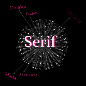 Serifs are those little embellishments that make fonts feel a little more traditional and respectable. Here’s a dictionary definition of “serif”: a slight projection finishing off a stroke of a letter in certain typefaces. In the “D” of DejaVu, below, notice the little projections, top and bottom, on the left side of the letter. Those are serifs. The capital “V” in the same word has two little bars that cap the top extremities of the “V.” Those flourishes are serifs. Designers of lengthy documents, such as books, generally favor serif types because they are believed to aid in readability.
Font Type 3: Decorative
Font Type 4: Headline

Font Type 5: Handwritten

Font Type 6: Modern
Furthermore, whether or not we realize it, design plays a huge role in how we perceive the value of a product. From books, to snacks, to beauty products, and even groceries, the power is often in the packaging.
Okay, as a result, we see fonts definitely play a role in what we buy and what brands we tend to favor. But surely there are some areas that are off limits to typographical brain hacking… right? Wrong!
LIGHTS, CAMERA, FONT SELECTION:
What Netflix Teaches Us About Fonts
For that reason, you will notice that even Netflix has a firm understanding of a font’s power and its ability steer people along a certain trajectory. Whether we realize it or not, one of Netflix’s main tools to grab our attention is its choice of fonts. Just take a look through Netflix’s menu and you’ll see dozens of different fonts, each one designed to give you a specific feel that’s consistent with the branding of that particular show or movie.
With that said, the next time you’re browsing Netflix’s selection, take a few minutes to examine the fonts used for each option—it might help you find your next favorite show!
FROM “NETFLIX AND CHILL” TO KEEPING IT REAL:
How to pick the best fonts for your marketing designs
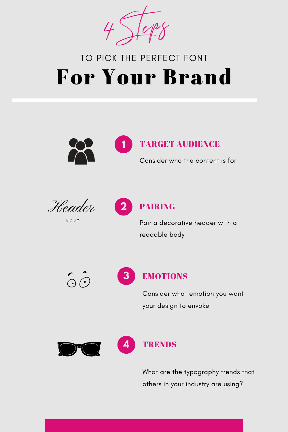
Though there are only six main font families, there are still a ton of fonts to choose from. It can be difficult to know where to start when picking your own. Just remember the mnemonic TAPET, and you’ll be sure to hit a home run with whatever selection you choose: Target Audience (TA), Pairing (P), Emotions (E), and Trends (T).
Psychology, fonts, and your Target Audience
Whenever you create content for your brand, it’s important to consider who the content is for. Think about the solutions your audience desires. In addition, consider their expectations. Then conclude, what might they be looking for from a company, service, or product like yours?
For example, would it make sense for an insurance company to use a quirky decorative font? Probably not.
Instead, people will be expecting more standard, classic fonts that convey a sense of efficiency and trustworthiness.
PAIRING
When landing on a font pairing, always pair a decorative header font with a nice, easy-to-read body font. The header should grab your audience’s attention while your body text should be easy to read.
EMOTIONS
Furthermore, it is wise to consider what emotion you want your design to evoke. Fonts have a unique and subtle psychological way of eliciting an emotional response from readers. The emotion a font evokes often has to do with the shape of the letters and our associations with those shapes.
Consider this:
If you had to choose which font seems happier, which one would you select?

Option 2, right?
Now choose which of these fonts seems more trustworthy:

Probably, not the playful font used in the first example.
As you can see, your font choice has a surprisingly big impact on how your audience perceives you.
Trends in Your Industry
When choosing your font, a good way to start is to look at typography trends. Also, learn how your competitors are designing their branded content. What kind of impressions do they make in logos, ads, and social media content? Then, once you have an idea of what other brands in your industry are doing, you can look for opportunities to stand out from the pack.
PUTTING PEN TO PAGE
Font psychology isn’t an exact science, but brand identity begins (or dies) with font selection. Harness what you know about your brand and your consumers in such a powerful way that your selected font becomes your brand’s visual figurehead, launching you into the next hemisphere of success.
In conclusion, when choosing your font, a good way to start is to look at typography trends and how your competitors are designing their branded content. What kind of impression do they make in logos, ads, and social media content? Once you have an idea of what other brands in your industry are doing, you can look for opportunities to stand out from the pack.
The world is your oyster. And with the right font – it’s yours for the taking.
Interested in more on this topic of psychology?
Check out these articles about psychology and marketing.


