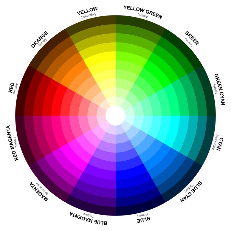
As web designers, we know color schemes are critical to appealing to your target audience. In our post “5 Reasons You Need a New Website Design” we reference a study that shows people form their first impression about a business within 3 seconds viewing the website. In 2-3 seconds you don’t have time to register content, but instantly you see the colors.
Color psychology studies how color affects human behavior. Since our reactions to color are largely subconscious, it is an intricate subject that is difficult to qualify. Skeptics of color psychology say that our reactions to colors are too subjective to classify; also, our responses vary due to gender, culture, personal experiences, and even moods. While these inconsistencies make research inconclusive, there are still studies that show that there is more to color selection than meets the eye.
Science, History and Color, Oh My!
First and foremost, color is important to web design because of the emotional responses they tend to elicit from the observer. The idea of color affecting our perception and emotions has been around for ages. While Sir Issac Newton discovered the color spectrum as we know it, ancient Egyptians are commonly accepted as the first people to study color. But most ancient cultures used/applied color psychology. Colors have been associated with deities, used for healing, and of course, art. For instance, black has long been negatively associated with darkness and evil in many cultures.
Contemporary science attempts to discover why we react emotionally to colors and the variables to our reactions. To put it very basically, our eyes send information to the hypothalamus. This data travels to the pituitary gland which releases hormones that are picked up by the endocrine glands. They, in turn, release other hormones directly into the bloodstream that end up absorbed by the thyroid glands. These thyroid glands release more hormones which have a direct affect on our feelings and overall disposition. All of these glands and hormones make up the endocrine system, which regulates our body’s moods and emotions.
Colors and Emotion
Let’s see it in action. The recycling symbol is a series of green arrows. How would you describe your reaction to this logo?
But notice the different internal response you have when the green arrows are replaced with purple ones. How do you feel when you view this color?

Even though you probably still recognize the distinctive arrows, the color choice can change the message. Besides being the socially accepted color of environmentalism, green has an equalizing property that is associated with restoration and balance. Purple and violet are tied to spirituality and introspection. There is something earthy and tangible to the color green, which fits the recycle logo, and something less tangible — more ethereal — to the purple.
Color Prejudice: Culture and Gender
There are 2 major variables involved in color psychology prejudice: culture and gender. Studies shows that while color preferences vary across cultures, the color blue is internationally the favorite color. Orange (one of the least favored colors according to most studies) is sacred to the Hindi religion, but isn’t even considered a color to a certain people living in Zambia.
Emotional responses to colors rely partially on context, which makes definitive statements about colors and their “message” difficult to make. The shade of a color can impact people differently, too. This website provides a nice understanding of the positive and negative emotions associated with colors. For instance, the color blue can imply positive properties like trust, calmness, and intellectual prowess, or it can communicate coldness, stoicism, or indifference. Black can represent darkness or evil, but it also represents sophistication. Studying these color associations can help in choosing the colors to represent your business, both in designing your logo and the colors for your website. It is important to look at how your culture typically views a color, but to also consider its context, as shown by this study in Psychology Today.
The other variable is gender. Typcially, men gravitate to different colors than women do, regardless of culture or region. While of course results vary, these are the favorite 3 colors according to gender:
Male: Blue, green, black
Female: Blue, green, purple
Orange and brown and even gray are generally found to be the least liked colors for both genders.
The Right Feel
Color can have an outstanding effect on the endocrine system, and there are many different schools of thought when it comes to applying color psychology in the marketing world. Jeremy Smith, an expert in online marketing, expresses the underlying idea, which is to use “the right color, the right way, at the right time, to the right audience, with the right purpose.” In other words, Smith concludes that achieving the right look is not the goal, but more importantly, the right feel.
Color association plays an important role in getting the right feel for the right audience. Consider your target market. What are they attracted to? What are their values? What are their aspirations? Then use the chart to find colors that represent these aspects.
Whole Foods has chosen green to suggest an earthy, balanced state. But is also an appropriate choice for banks like Fidelity Investments, being the color of money and even of envy. There is no clear cut color choice for a brand. Acknowledging color trends in your field can help you choose a fitting, yet competitively different, color scheme that sets you apart.
Business owners are wise when they use color theory to determine a color scheme that is attractive to your audience and fitting for your product and business. A professional custom website tailored specifically for your business is immensely better for your brand than simply adapting a cheap “one design fits all” website.


