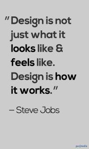
We look at a lot of websites. You could say that we are websiteseers. And we’ve noticed there’s a whole category of websites out that are somewhere between good and bad. Let’s call them the Bachelor Pad websites. A bachelor pad site is fully functional (so it’s not totally bad), but it’s so generic and unimpressive that it’s not good. You could say these sites need a “woman’s touch.” Some may only need touching up, but some need a completely new website design, and stat!
An unfortunate number of businesses (many that have been operating since before the age of the internet) still don’t realize this critical truth: your business will be judged by your website. Consumers don’t waste time on blasé websites. They’ll hit the back button so quickly you’ll barely know they were there… and you certainly won’t profit from it.
Review your own website for signs of bachelor pad-dom. If any of the following applies to your site, then make some changes. It’s a worthwhile investment.
5 Reasons You May Need a New Website Design
1) Your website is unimpressive.
Look at your website as objectively as possible. What is the first thing you think/feel when your website loads? If you are unimpressed, then how much less will a consumer be? (If you made your website, then get several outside honest opinions.) First impressions are A BIG DEAL for a competitive online presence. A website has between .2 seconds to 2.6 seconds to make a positive first impression on a visitor (source)…. basically from the second your site loads on a screen until the human eyes have time to focus. That’s all the time your site has to draw someone in.
2) Your site has little to no warmth or appeal.
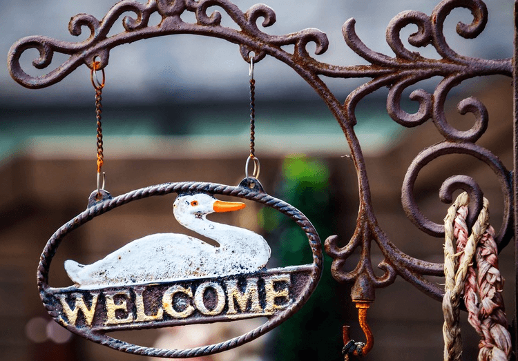
This may be hard to rate by yourself. Aesthetic appeal is subjective, so remember your target audience. Whatever their demographics, they are human beings. And human beings like a warm welcome. They like stories and personality. They like finding businesses that “fit” them.

Do the colors on your website represent the personality of your business? Do you have inviting photography? Are your photos and/or graphics of professional quality and high resolution? Does the language connect with your target audience? If the answer is no to any of these questions, then it’s time to make some changes. As soon as your site loads, a viewer should get a good idea of what you offer and who you are.
Good website design simultaneously reveals the personality of your business and appeals to your target audience while providing a solution. Viewers should instantly feel impressed and welcomed. Everything from the colors and photography to the warmth of the language affects this. Good marketing is sneaky: it should go (mostly) unnoticed. And good website design makes someone want to do business with you; it makes them look for a reason to choose you.
One definitive trend among bachelor pad websites is using poor quality photographs. The cliché rings true here more than ever: a picture is worth a thousand likes… I mean words. You must have quality, high-resolution photography on your website and social media. Period. This goes for every type of business.
3) Your plain-Jane website isn’t really that easy to navigate.
Read over your site’s home page and menus with fresh eyes. When people visit your site for the first time, what information are they probably looking for? What questions will they most likely have? Is it easy for them to find what they’re looking for right off the bat? People will leave your site if the content is confusing. They will be frustrated if there are too many links (or not enough). Don’t leave them annoyed with grammatical errors, and make sure it’s very easy for them to contact you or request services. If your site reminds people of a greasy-haired, sloppy-suited door-to-door salesman, then run — don’t walk — to meet with a website designer (ADD Jemully link).
Does the content draw in your viewers and clearly show them (a) what they need, (b) how you fulfill that need, and (c) how to contact you?
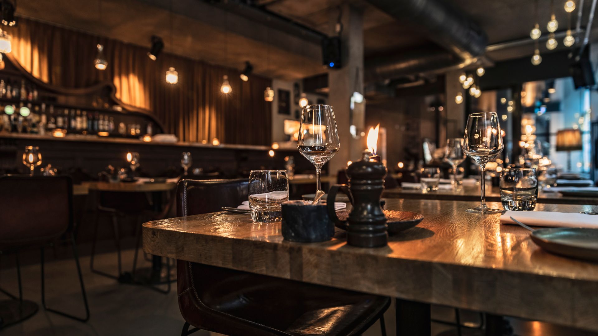
Usability goes beyond making sure your links work (which is a no-brainer.) When a site is intuitive for users, it contributes to its overall appeal. It’s like the difference between a cluttered, unorganized office space and a smooth, clean one. The latter is more appealing because it communicates efficiency without sacrificing style and personality, and there is room for more.
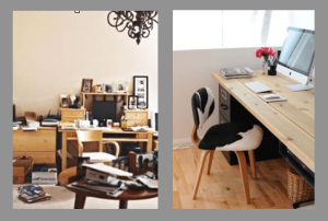
If your work space looks like the picture on the left and you like it, then no worries. But make sure your website design is more like the one on the right. Case in point: I am writing this in a coffee shop, and I just overheard a conversation between two business women discussing a possible partnership. Finally, one agrees on the profitability and likelihood of success because — get this — “the website is so inviting.” An inviting website instills confidence in consumers and potential partners.
4) You have less traffic on your site than a lonesome country road.
We all know that location drives real estate decisions, but it is no less important in website design. Don’t underestimate the value of good SEO (search engine optimization). When done well, SEO does marketing for you. It is important in the inner workings of design, but also requires an ongoing effort. You need an active presence in social media, because that is where consumers are. Online marketing is about strategic exposure, and you can’t do that without SEO and social media. Yasmin Bendror at Business 2 Community agrees:
It’s obvious that social media will continue to have a significant impact in 2014 on marketers and business owners: They now have the ability to reach out and communicate on a personal level with their target audience on a daily basis. This is a game changer for businesses engaging in marketing, sales, customer service and other business activities. This is very powerful, and has never been available with traditional marketing!
5) Your website design is obviously amateur.
Remember what your dorm room or first apartment looked like? Did you decorate with lava lamps and (almost) free garage sale furniture? To a consumer, an out-of-date or amateur website has the same lack of appeal as an inflatable sofa or sweaty Pearl Jam posters hanging everywhere.
The mark of a sophisticated website design is concept. Well-executed design concepts reveal the personality and story of a business through visual appeal, function, and content in a seemingly effortless way. It doesn’t have to be flashy or overly complicated; consumers are savvy, and they can tell the difference between an amateur work and professional web design. When a website lacks professionalism, then consumers assume that the business also lacks professionalism. Again, consider your target audience: if they are sophisticated, then your website design should be. If they are young, then catch their attention. If they are mature, then welcome them in. Use your website design to show consumers why you are exceptional.
We Can Help You!
Ok! So you read all that and you are starting to think your website might be a bit bachelor-y. What now? The good news is that even a small business can afford great website design.
Jemully can update or redesign your website in a way that highlights all the amazing uniqueness of your business. Don’t repel your online audience — invite them in. Offer them a warm beverage and start a conversation.
Also, let us help you get found. You don’t have to be an SEO specialist or social media guru to get your business actively involved in social media. We can set up your social media and make it work for you. Hook yourself up.
Or just be like Captain Hook.


